User Interface and graphic design are some of my favorite tasks in the development process! Beautiful interfaces are the ribbon on top of a polished game, and often set the first impression.
My tool of choice is Affinity Designer for its ease of use and artistic flexibility. I also know Figma and Adobe Illustrator.
Everything seen here is 100% my work as it comes from solo projects.
Veil: Alter Unknown
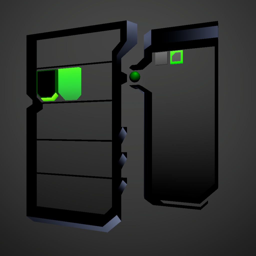
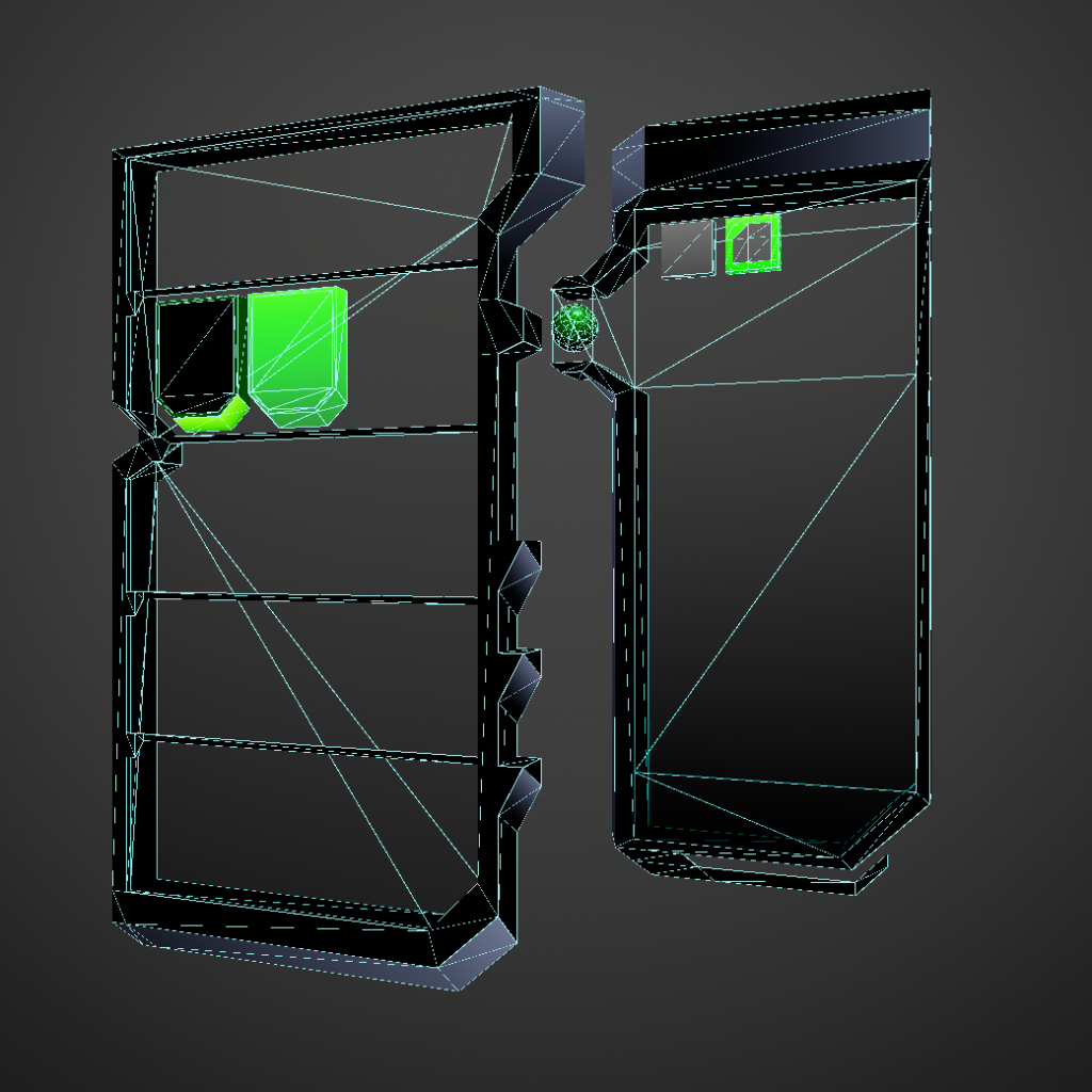
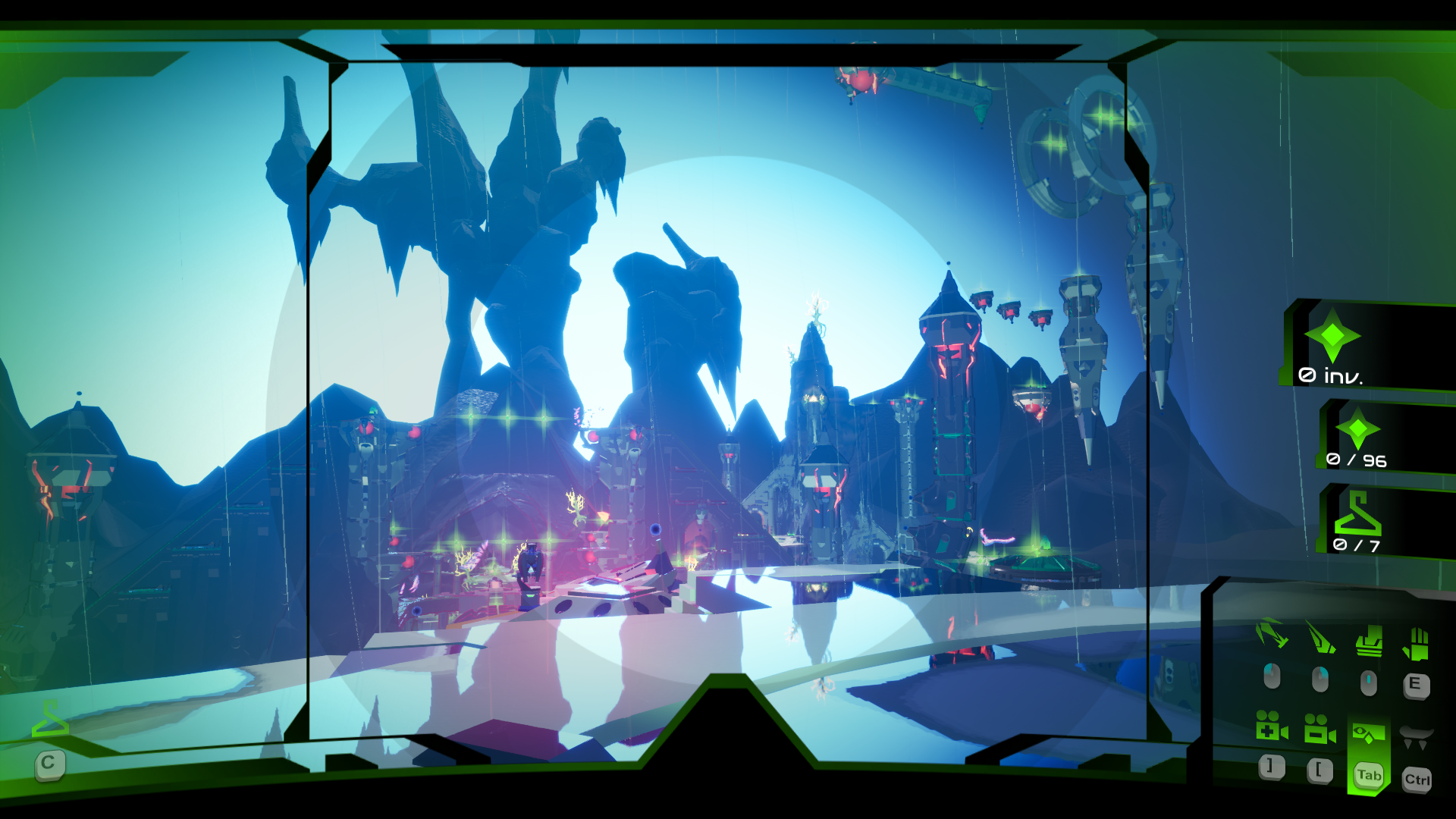
Most of Veil’s UI is 3D. I wanted to piece together menus inside a level to make use of Veil’s modular level logic blueprints. I also thought it would look cool if the player could tilt the menus in 3D space like in Super Smash Brothers.
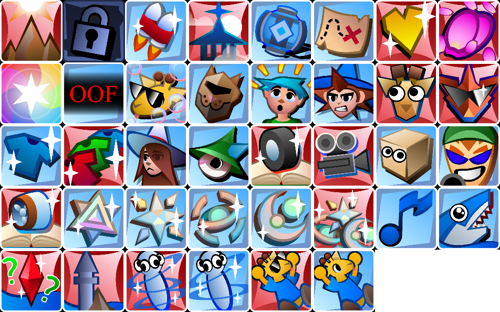
The customization menu was the hardest to design; balancing player choice with how complex the screen gets. I settled on all options being “tiles” and making sure colors and clothing options form neat rows of 3.

Most games lock color choice behind grindy unlocks (or paywalls). I say NAY!

Menu elements are colored using vertex colors, as is most of the game.


Here is the title screen with its Press Start animation! The logo was moved to the side to place a stronger focus on environmental awe. I added a ripple effect since I wanted players to feel like they were “diving” into the world.

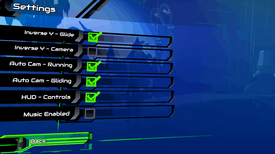
HUD is minimalist for immersion. Collectible information is stored away in the “visor mode”. If something is collected, the appropriate counter will temporarily display during normal gameplay.
Controls makeup most of it. I wanted to smooth over the learning process since the game gives you all abilities upfront.

Branding / Store Graphics
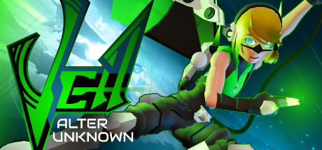
I believe COOL sci fi logos are unapologetically spiky. A big reason I named the game “Veil” was the V shape, aside from its theme surrounding hidden things.
Key art is a big deal. It’s the first thing a player sees. I wished to communicate the game’s sense of movement upfront, so Temple has her grapple rope and glider on full display.

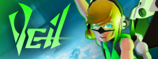
Small capsule uses a minimalist logo to read well.
Castle on the Coast
Castle on the Coast has a good, kid-friendly UI, but is not my finest work in terms of perfectionist graphic design. To view, check out the links below!


Branding / Store Graphics
The logo was heavily inspired by A Hat in Time, but with a magical twist. The off kilter text definitely says “this game is all about FUN”.
Upfront I knew George had some inherent appeal in his cute goofiness, so he always use his googly expression on key art. I also wanted to express the scrapbooky-style of the game.


Steam Achievements
I had fun with these! Many of them require exiting the game’s playable area by turning off the “Invisible walls” in settings. I was inspired by the YouTube series “Boundry Break”